Brand Guidelines
The photograph comes first. Everything else follows.
Framework
Shoot The Frame is a global portrait photography award. We exist to find exceptional portraits and give the people who made them a stage.
By the numbers
Our story
Every piece of communication should be consistent with this history. We started with portraits, broadened, and came back.
Launches with a single focus: portrait photography.
Monthly contests grow to three categories: portrait, landscape and wildlife.
The monthly rhythm ends. The inaugural Shoot The Frame Annual Portrait Award launches.
The Annual returns for its second year. Submissions open 1 November.
What we believe
Four principles sit behind every decision, from the website to a reply to a photographer.
The photograph comes first
Nothing we design competes with the work. Our type, colour and logo step back so the portrait leads.
Every photographer is credited
No photograph appears without the photographer's name. Credit is not optional, and it is never small print.
Craft over hype
We judge on beauty, power, creativity, technical skill and originality. We talk about the work the same way: specifically, without inflation.
Open to the world
Amateurs and professionals, from any country, judged anonymously. Our language should welcome someone entering for the first time.
The award, as we describe it
Use these names and descriptions exactly. They are written into the website, the rules and the books.
Category
One Frame
Honouring the strength of a single photographic portrait. Enter as many photos as you like; each is judged on its own merit.
1 photo US$17 · 3 photos US$27 · 7 photos US$37
Category
Photo Essay
A curated series of up to 15 portraits that connect as a complete body of work, judged as one unified entry.
Up to 15 photos US$49
Results are written Winner, Finalist and Honourable Mention, always capitalised.
Voice & Tone
We write the way a good judge talks about a photograph: calm, specific and generous.
Our voice
Voice is who we are, and it stays the same everywhere. Each trait has a line we don't cross.
We say what something is and let it stand. No exclamation marks doing the work, no "amazing".
We're glad to see people's work, and we show it by being specific about it.
Short sentences, everyday words. A line can still have rhythm: "Fourteen years of the awards, in print."
We write for photographers in every country. Clear English, no slang that only travels one way.
Tone by moment
Tone shifts with the moment. The voice doesn't.
Proud and specific. Name the photographer, the title and the category first.
Personal and direct. Use their name and their photograph's title. One clear next step.
Credit first, then one line. Let the image carry it.
Factual and complete. Dates, prices and requirements, stated once and exactly.
Say what happened, what we're doing and when. Apologise once, plainly.
Before and after
Real situations, rewritten in our voice.
Congratulations!!! You've been selected as a finalist in our amazing competition!
Your photograph Weaning Elowen is a One Frame Finalist in the 2025 Shoot The Frame Annual. It's printed on page 8 of the book.
Check out this STUNNING shot 😍🔥 #photography
One Frame Winner, 2025: Citizens of despair by @javierarcenillas.
Submit your best photos NOW and win big!
Submissions open 1 November 2026. One Frame entries start at US$17.
Don't miss out!! LAST CHANCE to enter!!!
Entries close 31 December. You have two weeks.
Unfortunately your submission was unsuccessful on this occasion.
Your photographs weren't selected this year. Thank you for entering. We'd love to see your work again in 2026.
Buy our awesome photo books today!
Fourteen years of the awards, in print.
Writing A to Z
The small things that keep every page and post consistent.
Three words, each capitalised, including The. Never ShootTheFrame or Shoot the Frame. STF is fine in internal notes and hashtags.
The book and the award year. "The 2026 Shoot The Frame Annual" for the award in full.
"Photographer: Name" on the website. On Instagram, the photographer's confirmed handle; if we don't have one, their full name.
Australian and British spelling throughout: honour, colour, favourite, judgement.
US$17, US$49. One currency for everyone. (The fees list on the homepage still says "USD $17": change it to US$17.)
1 November 2026. Day, month, year, no ordinals. Times in Melbourne time unless stated.
Use the photographer's own title and statement. Never write descriptions with AI or invent what a photo means.
Almost never. One is allowed when a photographer wins, in a personal message.
Not in captions, emails or the website.
Logo
Five letters, each built differently: a frame for every way of seeing. It's our most recognisable signature.
Two versions
Ink on light backgrounds, white on dark backgrounds and photographs. Nothing else.
Anatomy and clear space
The lockup always appears whole: the top line, the five letters and the founding year. Keep a clear margin around it at least the height of the F on every side (the dashed line).
Minimum size: 140 px wide on screen, 35 mm in print. The rules get too thin below that; use the icon instead.
The icon

The M, lifted from the logo, in white on an ink square. Use it where the full lockup won't fit: social avatars, the browser tab, app icons. Never use the icon next to the full logo. The M is the only letter used on its own; never pull out the F, R, A or E.
Please don't
The logo only works if it's always the same.
Typography
Gloock speaks; DM Sans explains. A sharp, high-contrast serif for what matters, a quiet sans for everything else.
Display
GloockABCDEFGHIJKLMNOPQRSTUVWXYZ
abcdefghijklmnopqrstuvwxyz
0123456789 ’26 “ ” &
Text and interface
DM SansABCDEFGHIJKLMNOPQRSTUVWXYZ
abcdefghijklmnopqrstuvwxyz
0123456789 US$ · — &
The scale
Taken from shoottheframe.com. Sizes are for desktop; headlines scale down on phones.
DisplayGloock 96 / 1.3
Global portrait photography awards.
HeadlineGloock 56 / 1.1
14 years of Shoot The Frame.
TitleDM Sans 600, 25 / 35
One Frame
BodyDM Sans 400, 17 / 31, −0.02em
Honouring the strength of a single photographic portrait. You may submit as many photos as you like, but each will be judged on its own individual merit.
LabelDM Sans 400, 13, caps, +0.08em
2026 Shoot The Frame Annual
ButtonDM Sans 500, 18
The 2025 Annual Gallery →
Rules
Gloock for names and big moments
Headlines, photographers' names, award titles, the year on key visuals. Keep it to a line or two.
DM Sans for everything you read
Body copy, captions, buttons, forms and small print.
Capitals only in labels
Uppercase is for small DM Sans labels with extra letter spacing. Never set Gloock in all caps.
No fake styles
Gloock has one weight. Don't bold, italicise or outline it.
Colour
Mostly ink and white, like a gallery wall. The accents are small and deliberate, so the photographs keep their colour.
Core
The logo, headlines and text. RGB 33 33 33.
Backgrounds. Let pages breathe around the photographs.
Accents
Each accent has one job. Use them sparingly and never on top of a photograph.
At 30% as a highlighter under key words in headlines.
Small signals: the live dot on the countdown, active states.
Name and date tags on key visuals.
Soft and transparent versions
Blue and pink also come in lighter strengths for highlights and soft backgrounds. Use the transparent value over white or light grey, and the solid value where transparency isn't possible (print, email, slides). Text on any of these stays Ink.
Highlight Blue
100% · colour blocks and tiles
The headline highlighter
Soft panels and feature rows
Signal Pink
100% · dots, active states
Highlights, sparingly
Soft panels and feature rows
Never put a tint over a photograph, and never set text in blue or pink: they're for backgrounds and marks only.
Supporting greys
Long text and statements in print.
Labels, captions, secondary information.
Hairlines, borders and dividers.
Balance
Roughly how much of each colour a page or layout should use.
Click any hex value to copy it.
Imagery
We don't have brand photography. We have the work of the photographers we celebrate, and we treat it with care.
How we use photographs
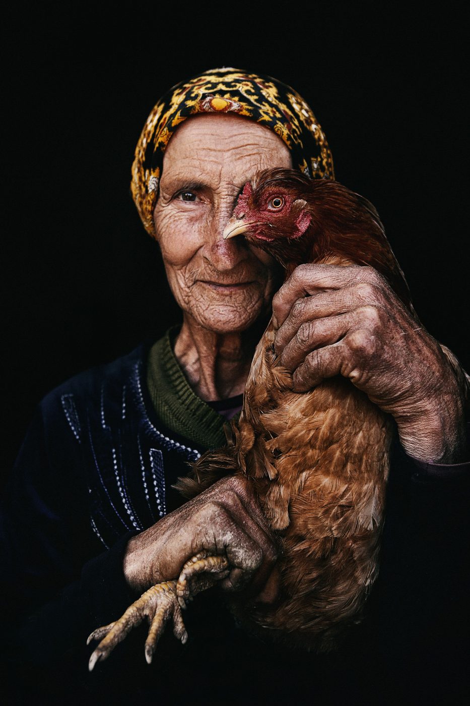
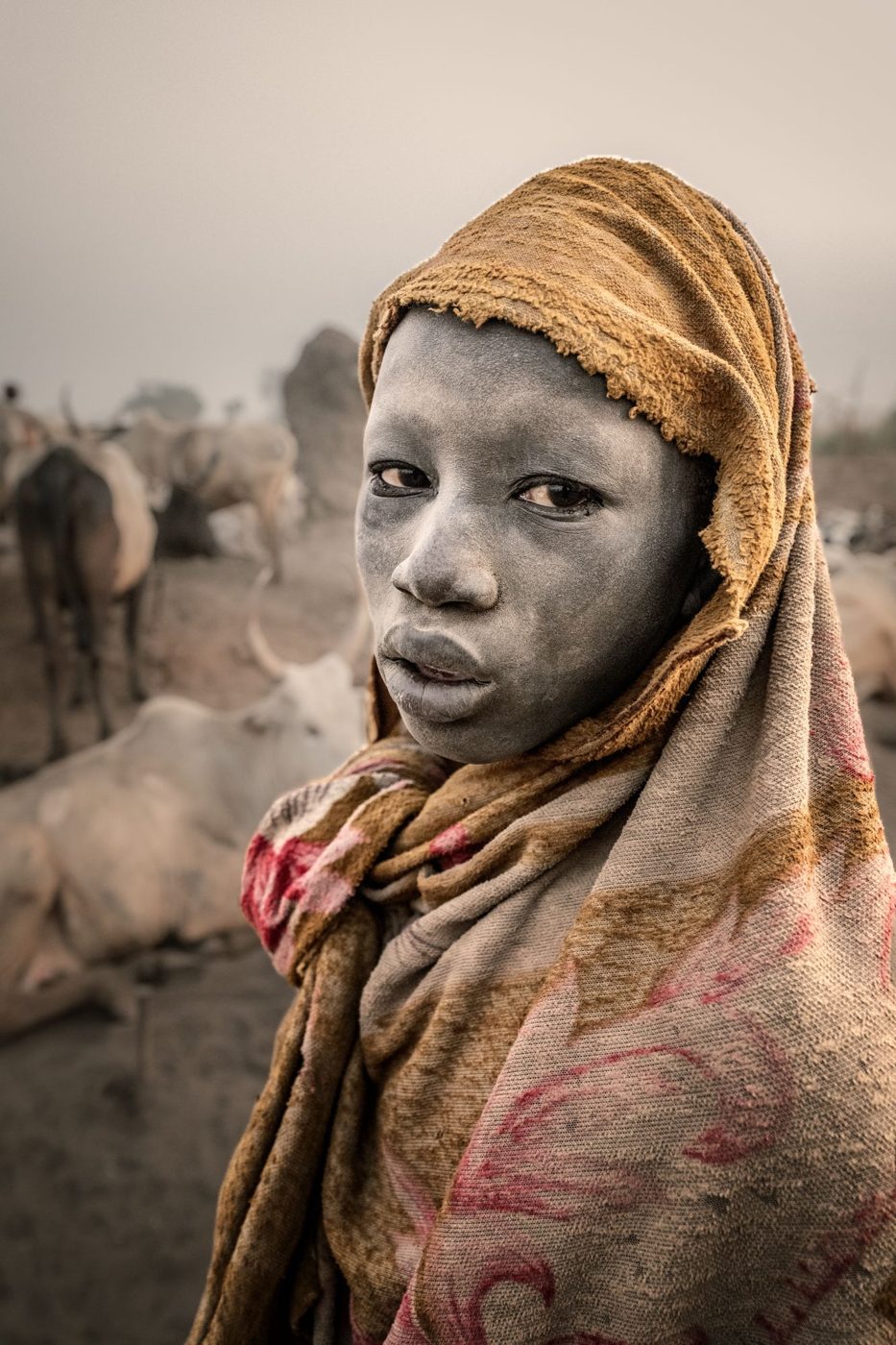
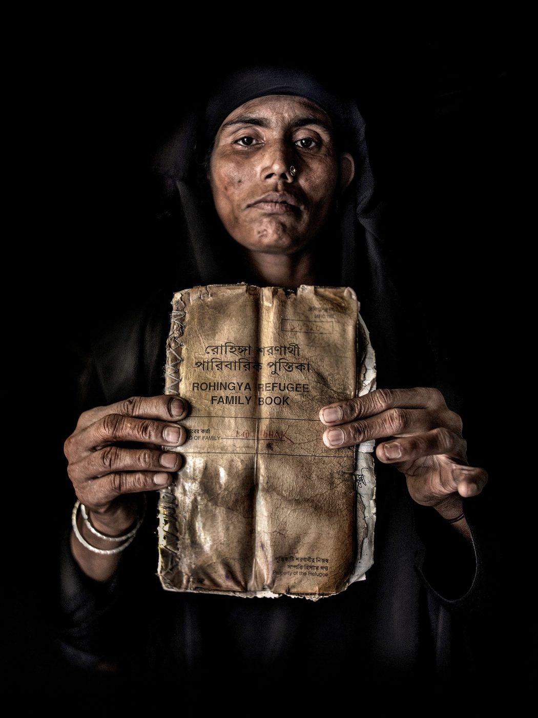
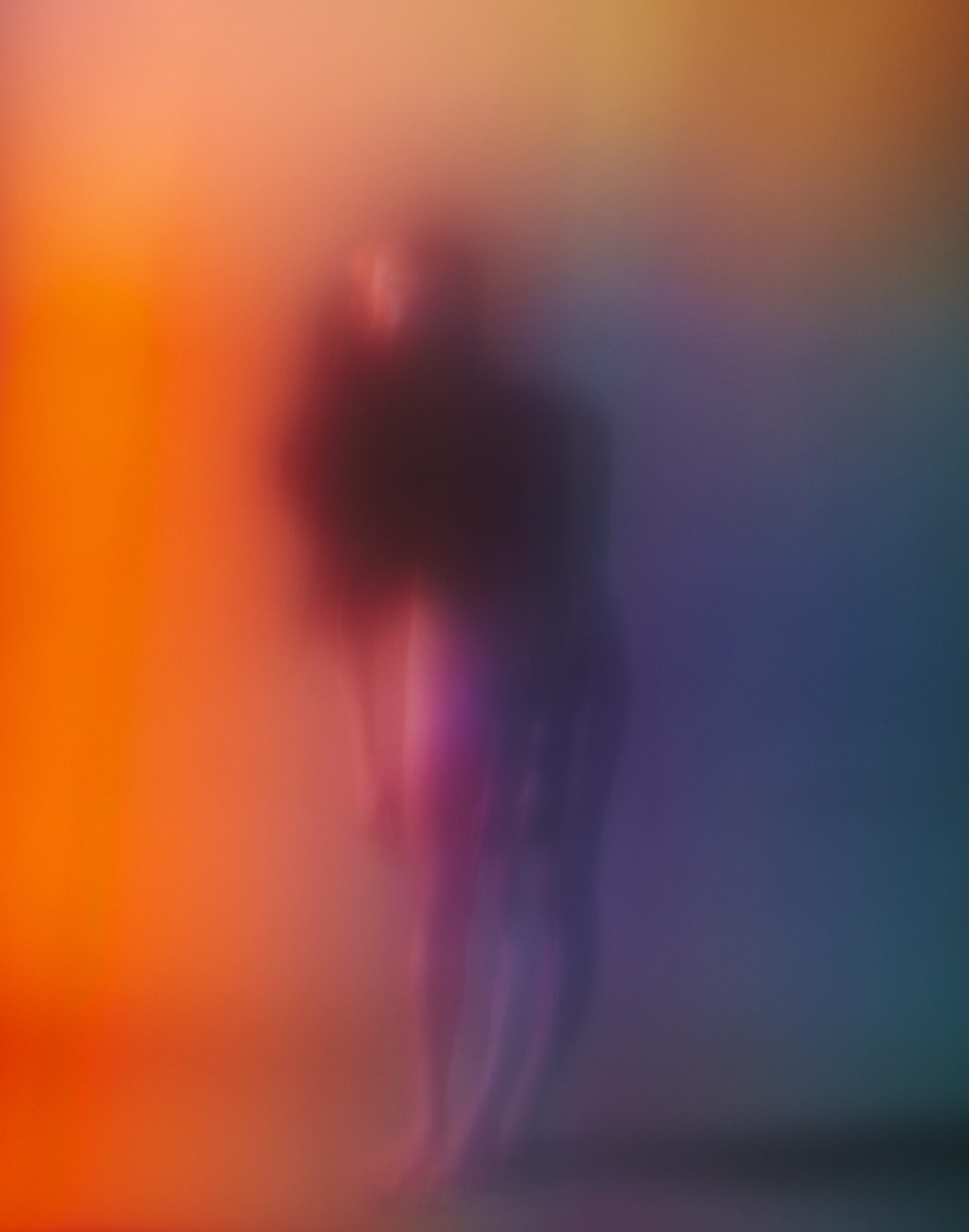
Every photograph carries the photographer's name or confirmed handle, every time it appears.
Books and exhibitions show the full frame. For social, crop only by the agreed crop rules, and never through a face.
No filters, tints, overlays or retouching. The only text on a photograph is the key visual system below.
Some award-winning work shows nudity, violence, conflict or people at their most vulnerable. It belongs in the gallery and the books, with the photographer's own words beside it. On social and in ads, leave out nudity and graphic or violent images, and never use someone's suffering as a hook.
2025 winners and finalists
The work that sets the standard. Always shown whole, at its own shape, with the photographer, the title and the result.
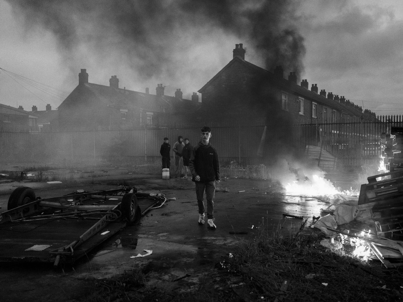
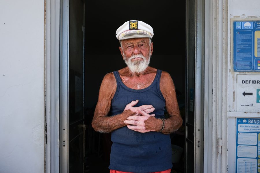
The key visual system
The 2026 campaign frames a winning portrait with the award's identity. Each one is a finished design: post it at 3:4 exactly as made.
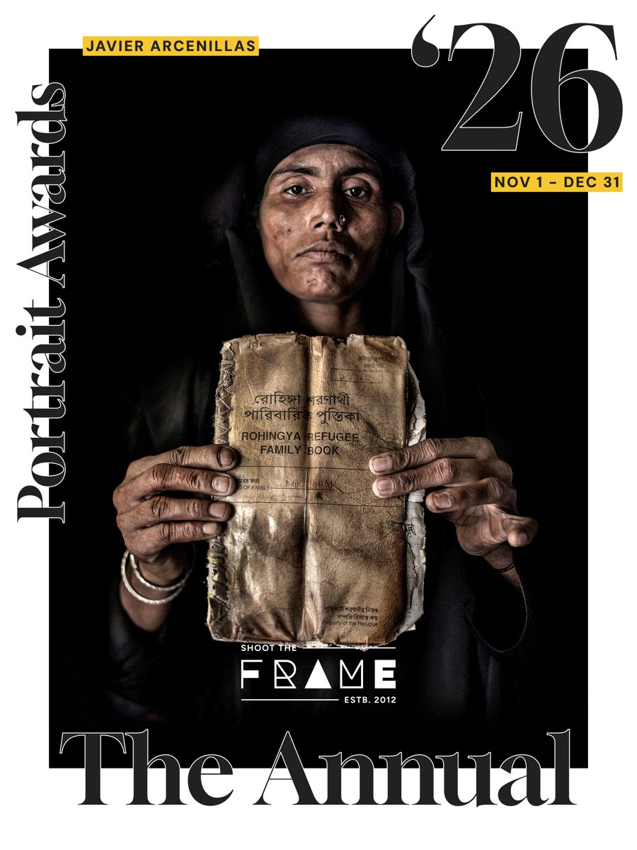
- Name tag. The photographer's name in small DM Sans caps on a Tag Yellow label, top left.
- The year. ’26 in Gloock, large, top right, with the dates on a yellow tag below it.
- Portrait Awards. Gloock, set vertically up the left edge.
- The logo. The white version, centred low, over a calm area of the photograph.
- The Annual. Gloock, set large across the base.
- Format. 2160 × 2880 px (3:4). Never padded or cropped.
2026 key visuals
Seventeen finished key visuals for the 2026 Annual, full size (2160 × 2880 px, 3:4). Partners, press and photographers are welcome to share them to promote Shoot The Frame.
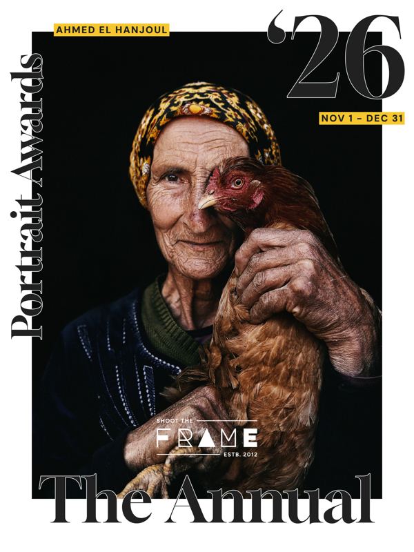
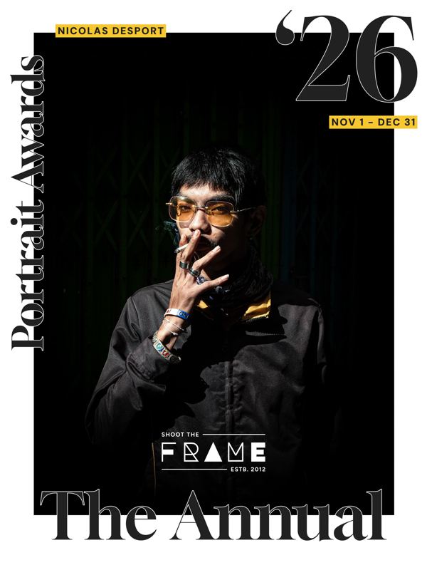
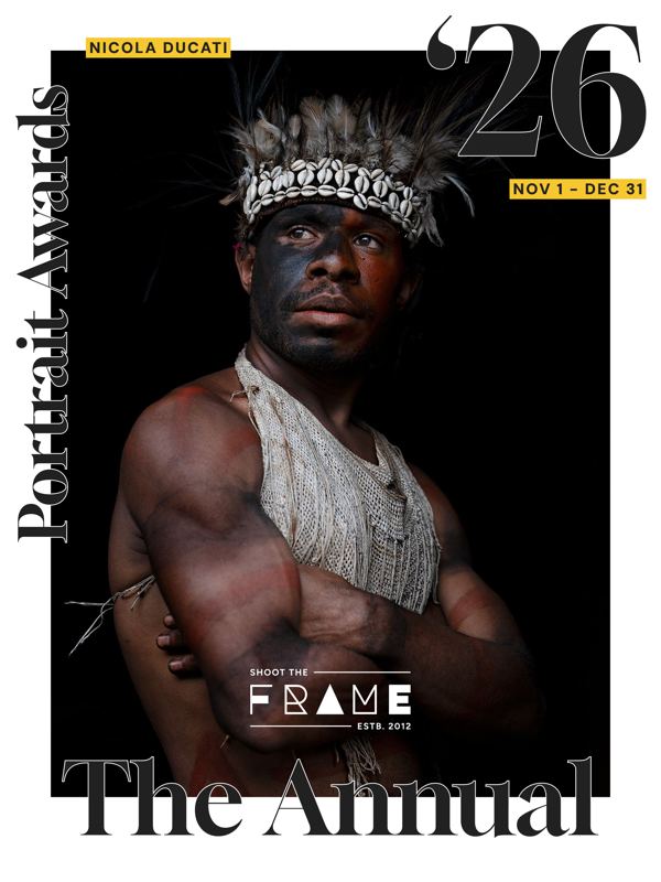
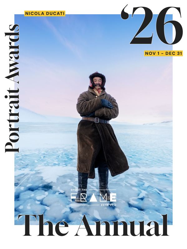
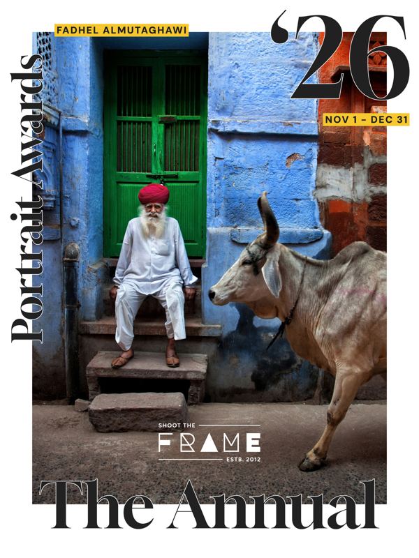
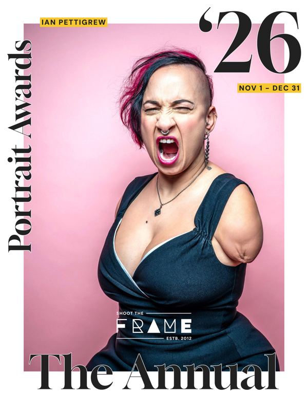
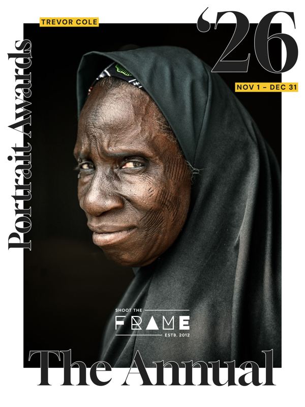
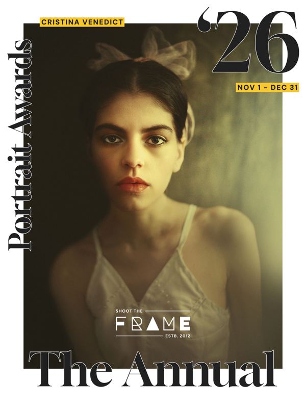
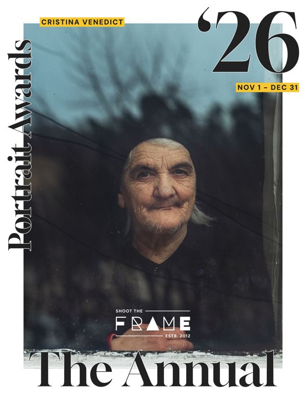
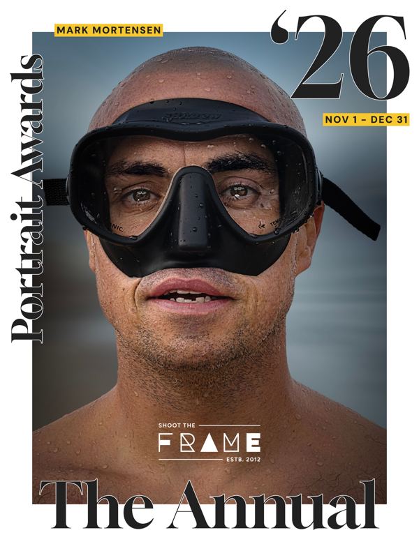
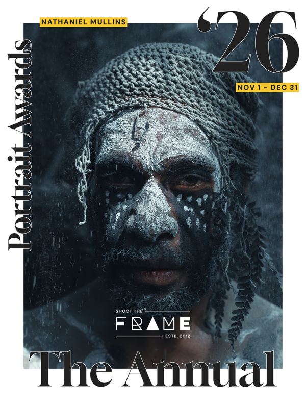
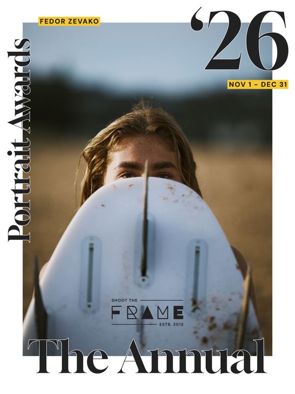
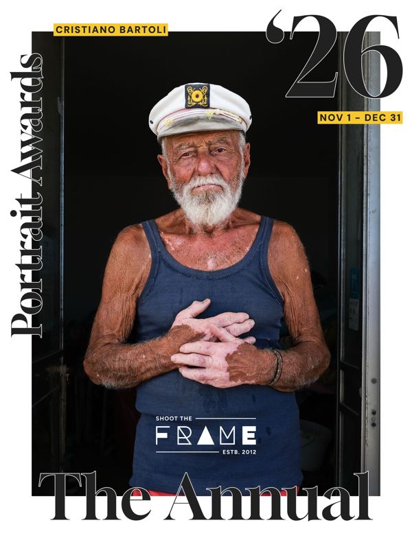
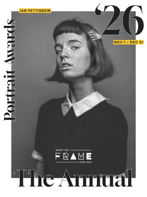
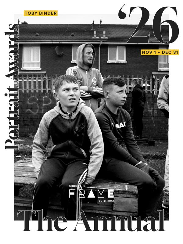
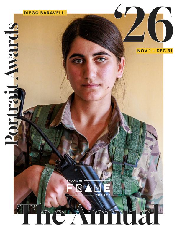
For press, exhibitions, print or anything beyond social, email admin@shoottheframe.com with the photograph, the photographer and how you'll use it. We'll check with the photographer and send you the original file with the right credit.
When you share a key visual: post it as it is (no cropping, padding, filters or added text), credit the photographer by their Instagram handle or full name, and link to shoottheframe.com. The photographs remain the property of the photographers.
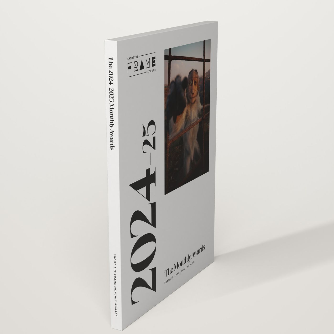
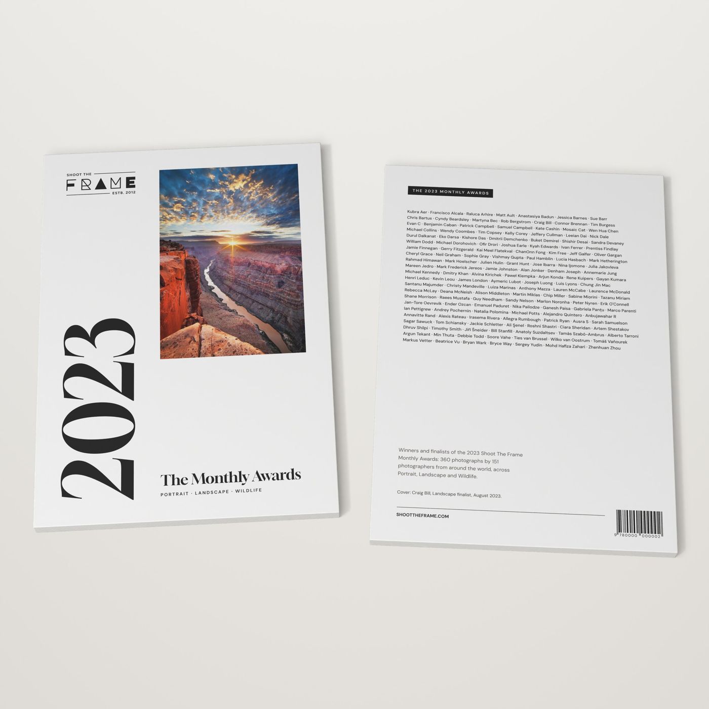
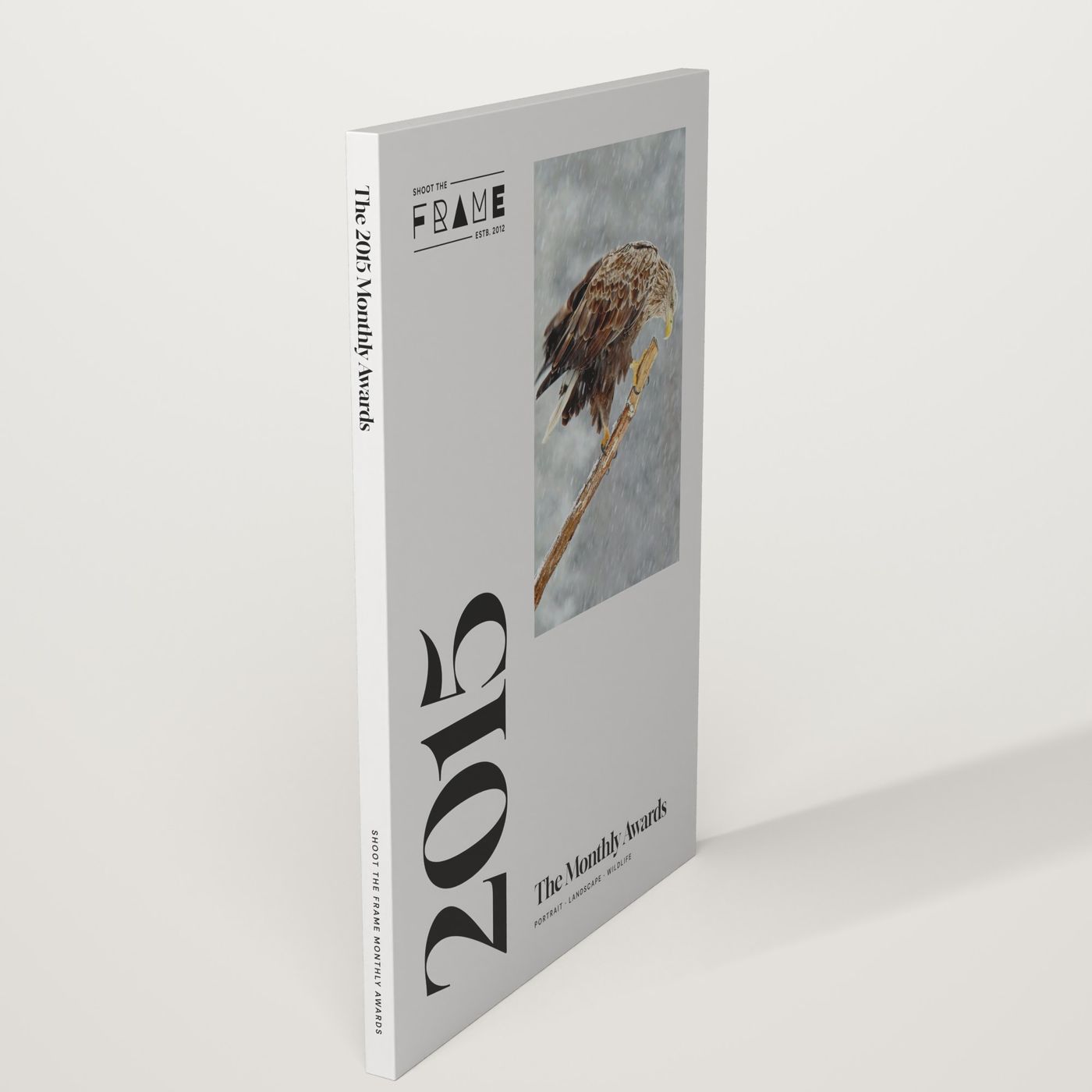
Fourteen years of the awards, in print. Twelve books, one system: quiet covers, full-frame photographs, every photographer named.
The series
Use these names, prices and details exactly, on the shop, in emails and on social.
The 2025 Annual
359 photographs by 67 photographers, across One Frame and Photo Essay. US$59.
The Monthly Awards
Eleven books, 2012–2014 to 2024–2025. Every monthly winner and finalist in Portrait, Landscape and Wildlife. US$49 each.
The format
Softcover, A4 (210 × 297 mm), printed to order and shipped worldwide. Each book has its own ISBN and barcode on the back.
Where to buy
shop.shoottheframe.com. In captions: "link in bio". One US$ price for everyone.
Covers
Every cover follows the same layout, so the series reads as a set on a shelf.
- Light grey ground. Never a photograph full-bleed: the cover frames one winning image.
- The year. Gloock, very large, running up the left edge. The book's name in Gloock beneath the photograph.
- One photograph. A winner from that year, shown whole and credited inside.
- The logo. Ink version, small, top of the cover.
- The back. Every photographer's name, in DM Sans, plus the ISBN barcode.
Inside the books
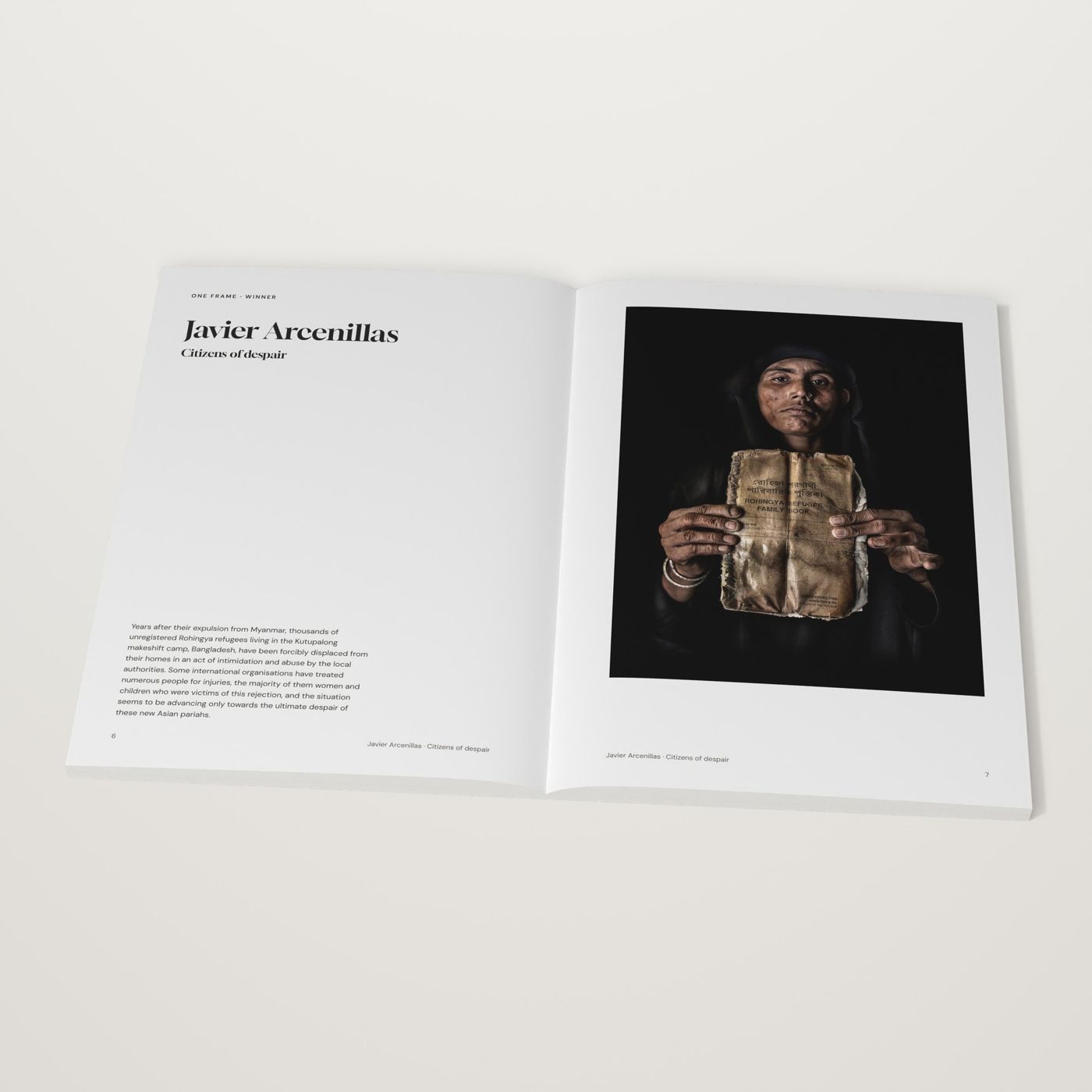
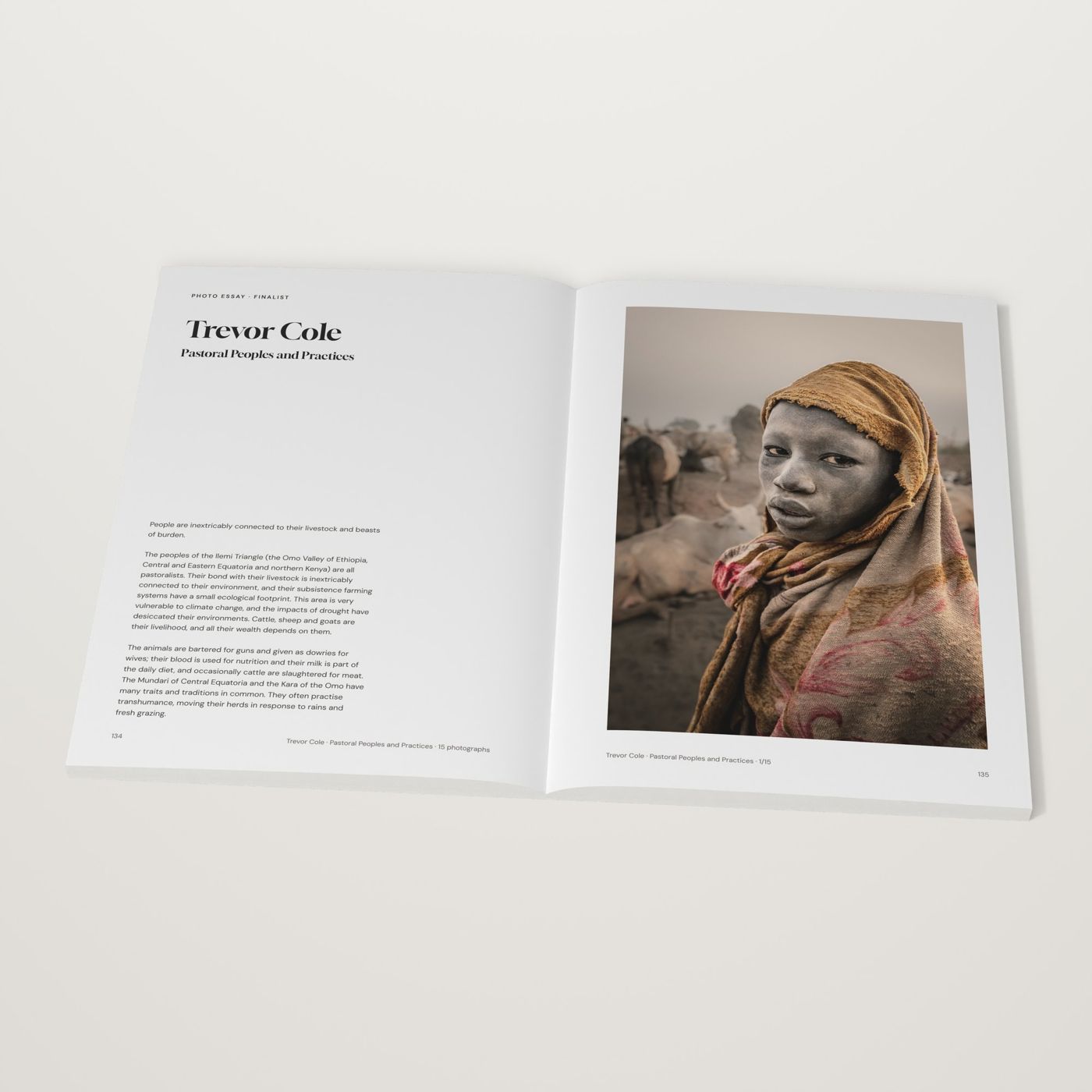
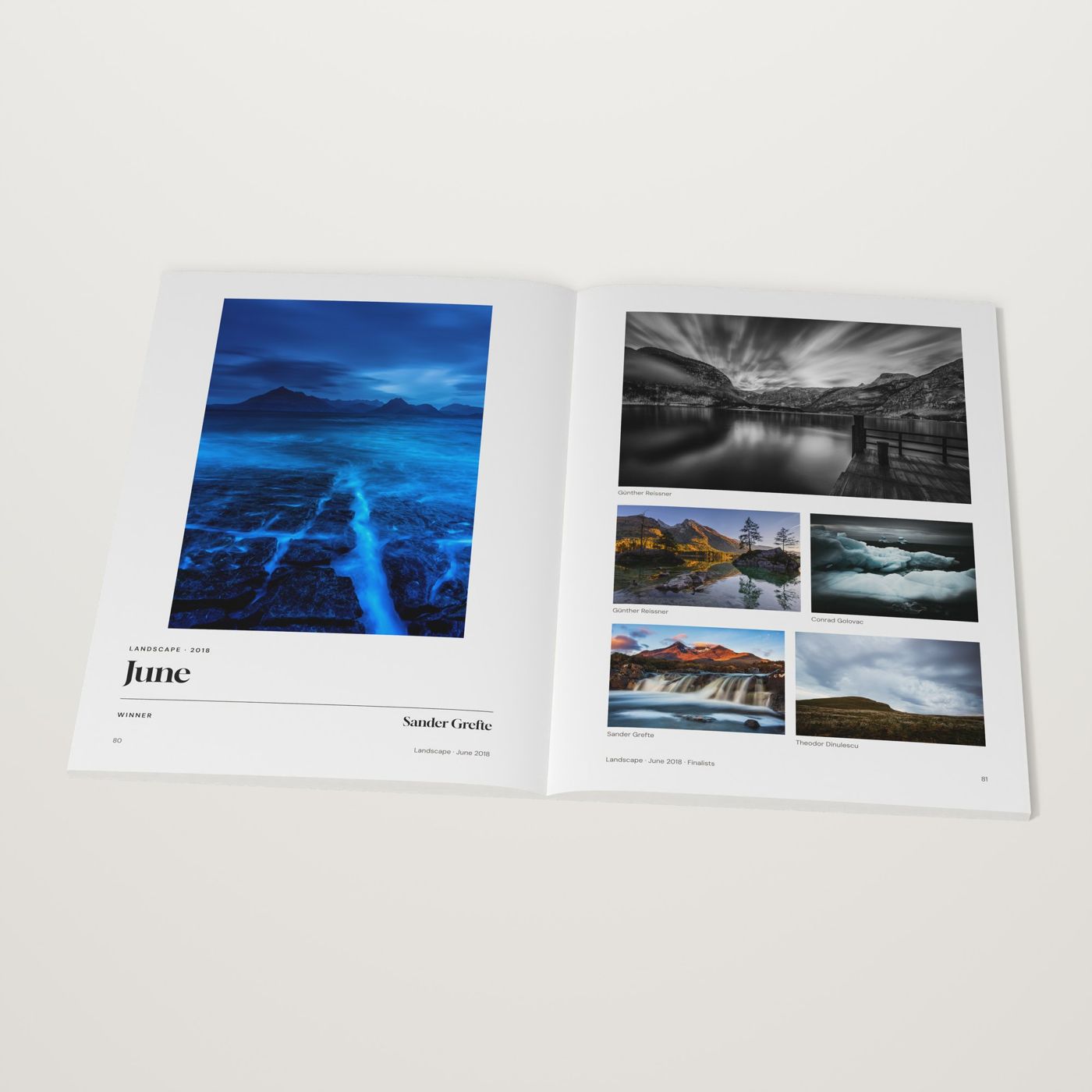
Winners open their month or their essay with the photograph on the right and their name in Gloock on the left.
Print rules
Every photograph is placed at its exact original shape. If it can't meet the margins, it sits inside them.
Size each photograph from its real pixels. Never upscale; small originals print smaller.
A4 with mirrored margins: inner 25.4 mm, outer 18 mm, top 18 mm, bottom 25.4 mm. Six columns. Photographs hang from the top line.
Gloock in #222222, the logo's ink. Body text #3B3935, page numbers #5F5B55, dark section openers #262421.
Body 14 px on 22, names 56 px Gloock, section titles 120 px Gloock. Five sizes only.
Every photograph is named on its page, and the index lists every page each photographer appears on.
The 2025 Annual's cover photograph contains nudity. On social and in ads, use the blurred cover or a spread instead.
Components
A small kit, used the same way everywhere. Hover the buttons: they behave exactly as they do on the site.
One dark primary per view, outline for the rest. 9 px corners, 2 px border. The outline fills with ink on hover; the dark button softens to 87%.
Highlight Blue at 30%, sitting under the lower part of the words. Once per headline at most.
Top right on every page while the award runs, aligned to the header. White pill, Signal Pink pulsing dot, Gloock numerals in fixed-width slots so the width never jumps. Hover (or tap on phones) opens the card underneath, the same width as the pill, with one dark primary and one outline button. It switches to “Submissions close in” at 7pm on 1 November (Melbourne time) and hides itself when entries close. Hidden while the photo viewer is open.
Photographer: Cristiano BartoliDirectly under the photograph in Muted DM Sans. "Photographer:" followed by their name as they write it.
Downloads
The brand kit
Both logos as SVG and PNG, the icon, the colour and type values as JSON, and a read-me. One zip, about 200 KB.

"accent-pink": "#C000DE",
"display": "Gloock"
The photographs on this page are for reference. For original files of any winning photograph, write to admin@shoottheframe.com and tell us where it will appear.
Fonts are free from Google Fonts: Gloock and DM Sans. For anything these guidelines don't cover, write to admin@shoottheframe.com with a mock-up.